Phone: +91-9310885321
 Email: support@learnhub4u.com

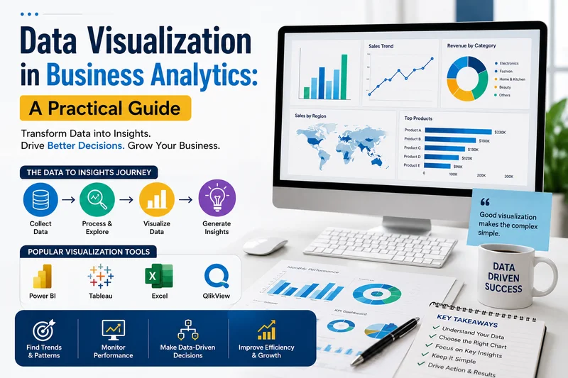
The No-BS Guide to Data Visualization in Business Analytics
Let's be honest for a minute. If I flashed a massive corporate spreadsheet on your screen right now—we’re talking 80 columns, 500 rows, and thousands of tiny, soul-crushing numbers—your brain would immediately check out. You'd start thinking about what you want for dinner or scrolling on your phone. It’s completely normal. Human brains just aren't built to process raw data dumps on the fly.
But if I show you a clean line graph where a bright red line suddenly takes a massive nosedive right around March? You don't even need to think. You instantly know something went wrong, and you know exactly when it happened.
That is the entire point of data visualization.
A lot of students come to us at Learnhub Education thinking that breaking into business analytics means they need to become coding hermits who just write complex Python scripts and run heavy statistical models all day. Look, the math and the code matter, obviously. But they are only half the equation. If you can't explain what those numbers actually mean to a manager, a client, or a marketing director who barely knows how to use Excel, your insights might as well not exist.
Data visualization is the bridge that turns cold numbers into real human decisions. Let’s break down how this actually works when you get out of the classroom and into a real job.
The Reality of Why Businesses Care
Companies today are absolutely drowning in data. Every single time a customer clicks a button, adds something to a cart, or leaves a page, a database registers it. But data on its own is completely useless. It's just noise until someone looks at it and makes a business decision based on it.
Visuals change the game for two massive reasons: speed and pattern recognition.
First, executives don't have time to read a 40-page text report just to find out if last month's ad campaign worked. They want to open a dashboard, glance at a couple of charts for twenty seconds, get the gist, and move on with their day.
Second, our eyes notice visual shapes way faster than numbers. If you look at rows of text, you’ll probably miss the fact that your product sales spike every single time it rains on a Thursday. But throw that data onto a quick scatter plot, and that trend stares you right in the face.
Dropping the Software Anxiety
When you start learning analytics, people online will try to stress you out about learning fifteen different fancy software tools. Don't fall for the hype.
Honestly, just start with Microsoft Excel or Google Sheets. Seriously. A shocking percentage of the corporate world still runs entirely on basic Excel sheets. It is the perfect place to learn how to clean up data and make quick charts without getting bogged down in complicated tech.
Once you feel good about the basics, you can move on to professional Business Intelligence tools like Tableau or Power BI. These are what companies use to build those live, interactive dashboards that update automatically. And if you enjoy the programming side, you’ll eventually mess around with Python libraries like Matplotlib.
But here is the secret we emphasize to everyone at Learnhub Education: the tool you use doesn't matter even ten percent as much as the logic behind your design. If you know how to tell a clear story with data, you can learn any new software program in a week or two. The principles are always the same.
How to Avoid Making Ugly, Confusing Charts
It is incredibly easy to make a terrible chart. Just because your computer gives you the option to create a 3D pie chart with neon pink and lime green slices doesn’t mean you should ever do it.
If you want your work to look like it was done by a professional and not a confused student, stick to a few basic guardrails:
First, delete the clutter. Beginners always want to add heavy borders, bright background grids, and text labels on top of every single data point. It just creates visual static. If a line or a label isn't actively helping someone understand the core point of the chart, delete it. Let the data breathe.
Second, stop using color just for decoration. Every single color choice on your page should serve a purpose. If you have a bar chart comparing ten regions, make nine of the bars a neutral gray and use a sharp blue for the one specific region you want the boss to look at. Also, don't forget basic business psychology: red means losing money or falling metrics, green means growth. Don't swap them around just because you think it looks pretty.
Finally, keep your scales honest. This is the biggest rookie mistake out there. If your vertical axis starts at 60% instead of 0%, a tiny 2% difference between two numbers will look absolutely massive. It misleads people. The absolute quickest way to lose your credibility in a company is for a manager to realize you exaggerated a chart to make a point look bigger than it is.
Building a Portfolio That Gets You Noticed
If you're trying to land your first analytics internship or an entry-level job, you don't need years of corporate experience to stand out. You just need to prove you can think like an analyst.
Head over to a site like Kaggle and download a free, open-source dataset on something you actually like—whether that's video game sales, Premier League football stats, or music streaming habits. Clean up the messy data, pick out two or three interesting takeaways, and build a simple, clean dashboard around them.
When you show this project to recruiters or post it on LinkedIn, don't just share a screenshot of the final chart. Walk them through your brain. Explain why you chose that specific layout, how you tackled the messy parts of the data, and what actual decision a business should make based on what your chart shows. That exact thought process is what hiring managers are desperately looking for.
The Takeaway
At the end of the day, analytics isn't just about being a math prodigy or a coding wizard. It's a communication game. You can build the most brilliant predictive algorithm on the planet, but it won't change a thing if the people running the company can't understand what your results mean.
Focus on building simple, clean visuals that put the person reading them first. If you want to cut through the heavy academic fluff and start building real-world projects that actually turn heads, come check out what we're building at Learnhub Education. We focus entirely on the practical, no-nonsense skills you need to transition from a curious student to a working professional.
FAQs:
1. Do I really need to learn Tableau and Power BI, or is just one enough?
Honestly, pick one and get good at it. They do mostly the same thing. If you know how to build a clean dashboard in Tableau, you can figure out Power BI in a week because the core design logic is identical. Most companies use whatever their IT department already pays for, so just learn the concepts first.
2. Can't I just use Excel for everything? Why bother with fancy tools?
You can do a lot in Excel, and honestly, a ton of businesses still run on it. But Excel chokes when you feed it millions of rows of data. Tools like Power BI or Tableau connect directly to massive databases and update your charts automatically whenever new data comes in, without crashing your laptop.
3. What is the single biggest mistake beginners make with charts?
Overcomplicating everything. Beginners get excited and add 3D effects, bright neon colors, heavy gridlines, and labels on every single data point. It looks like a circus. The best charts are incredibly boring to look at until you notice the one specific data point the analyst wanted you to see.
4. Are pie charts actually bad, or do people just hate them?
They aren't inherently evil, but they get abused. The human brain is terrible at comparing the angles of pie slices. If you have two slices that are 23% and 25%, they look exactly the same to your eyes. If you have more than three categories, just use a bar chart instead. It’s way easier to read.
5. How much math do I actually need to know to build dashboards?
You don't need calculus, but you do need a solid grasp of basic business math. You need to be completely comfortable with percentages, averages, ratios, and year-over-year growth calculations. The tool does the math for you, but you have to tell it what to calculate.
6. What does "cleaning data" mean, and why does everyone complain about it?
Data in the real world is filthy. People spell city names wrong, leave columns blank, or enter dates in five different formats. Cleaning means fixing all those errors before you make your charts. If you try to map data where "New York" is written three different ways, your charts will be completely wrong.
7. How do I build an analytics portfolio if I don't have a job yet?
Stop waiting for someone to hire you to start building. Go download a free public dataset on something you genuinely like—whether that's movie box office stats, Spotify streaming data, or housing prices. Build three clean dashboards, write a quick summary of what you found, and put it on LinkedIn.
8. What do recruiters actually look for when they see a dashboard portfolio?
They don't just care if the chart looks pretty. They want to see your problem-solving process. They look to see if you picked the right type of chart for the data, if your scales are honest, and if you included a clear takeaway that a manager could actually use to make a business decision.
9. Where can a total beginner start learning this without getting overwhelmed?
Don't start by trying to memorize a 40-hour course on software features. Start with a specific question you want to answer, like "Which video game console had the highest sales in the 90s?" Then, learn the exact steps needed to build that one specific chart. That practical approach is exactly how we teach analytics at Learnhub Education—you learn by doing, not by memorizing tools.