Phone: +91-9310885321
 Email: support@learnhub4u.com

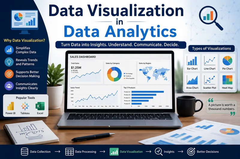
Why Data Visualization is the Real Superpower of Data Analytics
Imagine you are trying to pick a movie to watch with your friends. Someone hands you a 500-page printed spreadsheet containing the movie titles, runtimes, viewer ratings, budget breakdowns, and daily box office numbers.
How long would it take you to pick the perfect movie? Probably long enough that your friends would leave, order pizza, and watch whatever is trending on Netflix instead.
Now, imagine someone else hands you a simple, interactive chart that maps viewer ratings against genres, with little color-coded dots showing what's popular right now. Within three seconds, you spot a highly-rated comedy that isn't too long. Boom. Decided.
That is the magic of data visualization.
In the world of data analytics, raw data is the massive, intimidating spreadsheet. Data visualization is the clear, beautiful chart that actually tells you what to do. At Learnhub Education, we see students dive into analytics every day, and if there is one universal truth we’ve learned, it’s this: numbers are just noise until you give them a shape.
The Big Disconnect: Raw Data vs. Human Brains
Let’s be honest for a second. Human brains were not built to look at thousands of rows of numbers in an Excel sheet and instantly spot a trend. If I give you a list of 50 numbers and ask you to find the third-highest one, your eyes have to scan line by line. It’s slow, tedious, and honestly, pretty boring.
But our brains are incredibly fast at processing visual information. We can spot a bright red apple in a tree full of green leaves instantly. We notice when a line graph goes sharply upward or drops off a cliff.
Data visualization is simply the art of taking abstract numbers and translating them into the visual language our brains already speak fluently. It bridges the gap between what a computer stores (data) and what a human mind understands (insights).
Why You Can’t Have Analytics Without Visualization
People often think data analytics is all about heavy math, complex programming languages, and writing code that looks like it belongs in The Matrix. While the technical side is important, it’s only half the battle.
What happens when you finish your brilliant analysis? You have to present it to someone—a manager, a client, or a team of executives. And guess what? They usually don’t know how to code, and they definitely don’t want to read your raw script.
Here is why visualization is the ultimate tool for a data analyst:
1. It Tells a Story (And Humans Love Stories)
Think about your favorite video game dashboard or fitness app. It doesn't just list your raw running steps; it shows a ring filling up, a weekly bar chart, and a shiny badge when you hit a goal. It tells the story of your progress. In business, a good chart tells the story of the company. It shows exactly where sales spiked, when users lost interest, or which product is quietly carrying the entire business.
2. It Saves Time
In the business world, time is literally money. Leaders need to make fast choices. A well-designed dashboard lets a CEO look at a single screen for ten seconds and know exactly how the company is performing today. They don't need to read a twenty-page report.
3. It Reveals Hidden Patterns
There is a famous concept in statistics called Anscombe's Quartet. It’s a group of four different datasets that look almost identical when you run standard math calculations on them (same average, same variance). But when you plot them on a graph, they look completely different—one is a straight line, one is a curve, and one has a massive outlier. Without looking at the visual graph, you would think the datasets are identical. Visualization prevents you from missing the real truth.
The Visual Vocabulary: Choosing the Right Chart
One of the first things we teach students at Learnhub Education is that data visualization isn't just about making things look pretty. It’s about communication. If you choose the wrong chart, you can actually confuse people more than help them.
Let’s look at the basic tools in your visual toolbox:
Bar Charts: The undisputed heavyweight champion. Use these when you want to compare different categories (e.g., comparing sales across five different store locations). They are simple, but everyone understands them instantly.
Line Graphs: The time travelers. These are perfect for showing how something changes over time (e.g., tracking website traffic month-by-month over a year).
Pie Charts: The dangerous ones. Pie charts are great for showing parts of a whole (like a budget breakdown), but only if you have a few slices. If you try to put 15 slices in a pie chart, it just looks like a colorful mess.
Scatter Plots: The relationship testers. These show how two different things interact. For example, you could plot study hours on one side and exam scores on the other to see if more studying actually correlates with higher grades.
Golden Rules for Creating Great Visuals
If you are just getting started in data analytics, here are a few simple human-to-human rules to keep your charts clean and effective:
Keep it simple. The biggest mistake beginners make is trying to use every color in the rainbow and five different fonts. If a visual element doesn't help explain the data, delete it.
Label everything clearly. A chart without labels is just abstract art. Make sure your titles, axes, and legends actually tell the viewer what they are looking at.
Don't distort the truth. Always start your chart axes at zero unless you have a very specific, well-explained reason not to. Changing the scale can make a tiny difference look like a massive emergency, which misleads your audience.
The Path Forward
Data analytics is one of the most exciting fields to be in right now because every single industry—from sports and fashion to healthcare and finance—relies on data to make decisions. But remember: data is useless if it sits locked away in a dark database.
Learning how to clean data and run algorithms is a great start. But learning how to visualize that data, to turn numbers into pictures that make people go "Ah, I get it now!"—that is what makes you irreplaceable.
If you are ready to stop just staring at spreadsheets and start telling powerful stories with data, we are ready to show you how. Explore the world of analytics with us at Learnhub Education, and let's turn those numbers into something remarkable.
FAQs:
1. Do I really need to learn this stuff if I’m already great at coding and math?
Yeah, you do. Look, you can write the most insane code on earth, but if the boss who pays you doesn't get it, it's useless. They aren't going to look at your Python script. They just want a simple chart that tells them what to do next.
2. What’s the biggest mistake people make when starting out?
Trying way too hard to make it look cool. They throw in ten different colors, weird 3D effects, and text everywhere. It just ends up looking like a huge mess. The best charts are the ones that are so simple you get the point in one second.
3. Should I learn Tableau or Power BI first?
It doesn't matter all that much because they do the exact same thing. Just look at job boards where you live and see which one companies are asking for more. Power BI is great if you love Excel; Tableau is better if you want things to look sleek. Pick one and stick with it.
4. Is Excel dead for this kind of work?
Not even close. People love to hate on Excel, but everyone uses it daily for quick, simple charts. But yeah, if you are dealing with massive amounts of data that need to update automatically every hour, you'll need to step up to Power BI or Tableau.
5. How do I choose the right chart?
Just think about what you are trying to show. Comparing different things? Use a bar chart. Showing how something changed over time? Use a line graph. Trying to see if two things relate to each other? Grab a scatter plot. Don't overthink it.
6. Why does everyone hate pie charts?
Because our brains are awful at comparing the sizes of slices when they're close. If you have five or six slices, it’s a guessing game as to which one is bigger. A horizontal bar chart tells the exact same story but is way easier on the eyes.
7. Is this a math skill or an art skill?
It’s a mix of both, honestly. You need the technical brain to clean up the data so the numbers are actually right. But you also need a bit of a creative eye to pick the right colors and layout so people can read it without getting a headache.
8. What’s the actual difference between a chart and a dashboard?
A chart is just one graph. A dashboard is like the control panel of a car—it puts a bunch of different charts onto one screen so a business owner can see everything that’s happening in real-time.
9. How many colors should I actually use?
Keep it down to two or three. Use gray or muted colors for the regular stuff, and save a bright color like red or bright blue for the exact spot you want people to notice. If everything is colorful, nothing stands out.
10. What does a "misleading" chart look like?
Usually, it's when someone messes with the numbers on the side. Like, if a graph starts at 50 instead of 0, a tiny little sales bump looks like a massive explosion. The numbers might be real, but the visual tricks your eyes.