Phone: +91-9310885321
 Email: support@learnhub4u.com

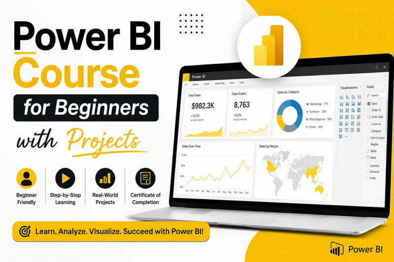
Look, You Don't Need to Be a Genius to Learn Power BI. Just Build Stuff.
Let’s be real for a second. Staring at an Excel sheet with ten thousand rows of numbers is soul-crushing. Your eyes blur, your brain shuts down, and you have absolutely no clue what the numbers are trying to tell you.
That is the exact reason why everyone and their boss is talking about Power BI right now.
It basically takes that massive, ugly pile of data and turns it into clean, interactive charts that actually make sense. Instead of guessing, you can look at a screen and immediately say, "Oh, wow, our shop in Chicago is losing money because shipping costs doubled."
At Learnhub Education, we think sitting through long, dry lectures about data theory is a total waste of time. You don't learn how to drive a car by reading the manual, right? You learn Power BI by opening it up, breaking things, clicking buttons, and building real things.
Here is the honest, no-nonsense roadmap to learning it without losing your mind.
The Only Three Things That Actually Matter in Power BI
Forget all the heavy corporate jargon. When you boil it down, using Power BI is just a three-step routine:
1. Cleaning up the garbage (Power Query)
In the real world, data is messy. People misspell names, leave dates blank, or accidentally enter things twice. Power BI has a tool built inside it called Power Query. It’s like a digital washing machine. You click a few buttons to strip out the junk rows, fix the typos, and get everything looking neat.
2. Making the files talk to each other (Data Modeling)
Say you have one Excel file that lists your employees, and another file that shows how many sales each person made. Power BI needs to know they belong together. All you do is click on the "Employee ID" column in the first list and drag a physical line to connect it to the same column in the second list. That's it. Now your files are linked.
3. Writing simple math shortcuts (DAX)
DAX is just a scary name for formulas. If you’ve ever written a basic =SUM or =AVERAGE in Excel, you already know how to do this. It’s just the language you use to tell Power BI things like, "Hey, calculate our total profit margin for just this month."
Once you do those three things, you get to do the fun part: dragging charts onto the screen and picking colors.
3 Projects You Should Build to Actual Get Good
If you want a resume that people actually look at, stop making basic, boring bar graphs. You want to build stuff that looks like a real business problem. At Learnhub Education, we always start students with these three exact projects:
Project 1: The Online Store Sales Tracker
The Goal: Show an online store owner exactly what is selling and what isn't.
What you'll do: You take a raw sales spreadsheet and clean it up. At the top of your page, you put huge, bold text cards for Total Revenue and Total Sales. Below that, you add a simple bar chart showing sales by product category (like shoes vs. hats).
The cool feature: You’ll add a little button on the side called a "slicer." When someone clicks "Winter," the entire dashboard instantly updates to show only winter sales. It looks incredibly professional and takes about two clicks to set up.
Project 2: The HR Burnout & Turnover Dashboard
The Goal: Figure out why employees keep quitting.
What you'll do: Working with HR data is awesome because it's about people, not just money. You'll write a quick formula to track employee turnover rates, and then plot out employee satisfaction scores against how long they’ve worked at the company.
The cool feature: This is where you find the "hidden stories." You might notice that people in a specific department always quit right after their two-year mark. That’s a massive insight you can hand to a manager.
Project 3: The Live Web Tracker
The Goal: Use data that changes by itself without you touching it.
What you'll do: Instead of uploading an Excel file from your computer, you connect Power BI directly to a live website link—like a public health tracker or global weather feed. You’ll use a map visual where circles over different cities automatically grow or shrink based on live updates.
The cool feature: You can set up an automatic refresh. Every single time you open the file, Power BI grabs the newest info from the internet completely on its own.
Two Major Mistakes Beginners Always Make
When people first start out, they get super excited and try to use every single flashy chart on the screen. It always ends up looking like a chaotic, neon nightmare.
Keep these two simple rules in mind to make your work look clean:
Stop using a million colors. Pick two main colors and stay there. Only use a bright color like red when something is going seriously wrong. If everything on your screen is bright and colorful, nothing stands out.
Put the big stuff at the top left. People naturally read screens from top-left to bottom-right. Put your most important numbers (like total profit) right where eyes look first. Save the detailed tables and lists for the bottom of the page.
Just Start Digging In
Power BI looks intimidating when you see a finished, complicated dashboard, but it’s really just a few simple steps chained together. You don’t need a background in coding, and you definitely don’t need to be a math whiz.
If you are tired of dealing with slow, clunky spreadsheets and want a skill that stands out, it's time to actually start doing it. Come check out our hands-on beginner resources at Learnhub Education, grab some sample data, and start building your very first project today.
FAQs:
1. Do I need to be good at coding or math to learn Power BI?
Absolutely not. If you can write a basic formula in Excel (like adding a couple of cells together) and you know how to drag and drop files on your computer, you can learn Power BI. It is built for regular business people, not computer scientists.
2. What is the biggest mistake beginners make when designing dashboards?
They try to make it look like a video game with way too many colors and every single chart available. It ends up looking chaotic. The best dashboards are simple. Use only two or three colors, keep plenty of blank space, and make sure your most important numbers are huge and at the top left.
3. What on earth is DAX, and should I be scared of it?
DAX stands for Data Analysis Expressions. It’s just a fancy name for Power BI’s formula language. Don't let the name scare you. It’s basically Excel formulas on steroids. It helps you calculate things like "total sales this month compared to last month." You start with simple ones and pick up the tricky ones as you go.
4. Can I use Power BI for free?
Yes! You can download Power BI Desktop completely free on your computer. You get access to almost all the data cleaning and dashboard building features without paying a single dime. You only need a paid account later if you want to share your dashboards online with a team.
5. Why do we focus so much on projects at Learnhub Education?
Because watching tutorials without actually doing the work is a trap. You think you understand it until you open a blank screen and freeze. Building real projects forces you to hit real problems, make mistakes, fix them, and actually remember how the tools work.
6. Can I run Power BI on a Mac?
This is a huge pain point: Power BI Desktop does not run natively on a Mac. It only runs on Windows. If you have a Mac, you’ll need to use a workaround like running a virtual Windows machine (using software like Parallels) or using a cloud-based Windows desktop.
7. How long does it actually take a beginner to get good?
If you spend an hour or two a day practicing with real data, you can learn the core basics—importing data, linking tables, and building a clean dashboard—in about 2 to 3 weeks. Becoming a master at complex formulas takes longer, but you can build job-ready dashboards pretty quickly.
8. What is Power Query, and why do I keep hearing about it?
Think of Power Query as a digital washing machine for your data. In the real world, data is filthy. People type names wrong, leave rows blank, or mix up date formats. Power Query is the tool inside Power BI where you click a few buttons to scrub all that junk out before you build your charts.
9. What is a "slicer" in Power BI?
A slicer is just a fancy word for an interactive button or filter on your dashboard. For example, you can add a slicer for "Year" or "City." When someone clicks "Chicago," the whole dashboard instantly shifts to show only Chicago's numbers. It makes your reports incredibly fun to play with.